Date: Fri, 25 Aug 2006 10:21:40 +0200
On Fri, 25 Aug 2006 09:54:33 +0200 "Anselm R. Garbe" <arg_AT_10kloc.org> wrote:
> On Fri, Aug 25, 2006 at 09:26:31AM +0200, Sander van Dijk wrote:
> > On 8/25/06, Anselm R. Garbe <arg_AT_10kloc.org> wrote:
> > >I thought a while about colorization issues and found, that the
> > >inverting of an existing color set has the advantage, that the
> > >inverted color fits well (which is often not the case for yet
> > >another color tuple).
> > >
> > >However, I consider the following idea:
> > >
> > > 1 text color
> > >+ 1 border color
> > >+ 1 bg color for selected objects (client borders, client titles,
> > >tags)
> > >+ 1 bg color for unselected objects (client borders, client titles,
> > >tags)
> > >+ 1 bg color for status info
> > >
> > >= 5 colors
> > > [...]
> > >
> > >What do others think about this idea?
Nothing... ;-)
> > One bordercolor is a good idea, as yesterday's tip clearly showed that
> > mixing different bordercolors doesn't work. I'm starting to like the
> > idea of different background colors too. Having just one textcolor
> > keeps thing simple, but it does put quite a restriction on possible
> > colorschemes (i.e. if you have a dark textcolor, all bgcolors must be
> > light if you want to keep thing readable). So I'm not sure what to
> > think about that yet (though the fact that it keeps things simple does
> > appeal to me, and it seems to work for Acme...).
>
> Having a fixed text color forces to make sane color schemes and
> keeps the amount of colors small (otherwise we'd have +3-1 more
> colors in dwm which can get a pity) - options are bad.
But changing text colour allows to emphasize highlighting. And a
single text colour does not fit all background colours.
Actually I wonder why you try to educate people in their use of
colours. I'd prefer suggesting good defaults, but not restricting
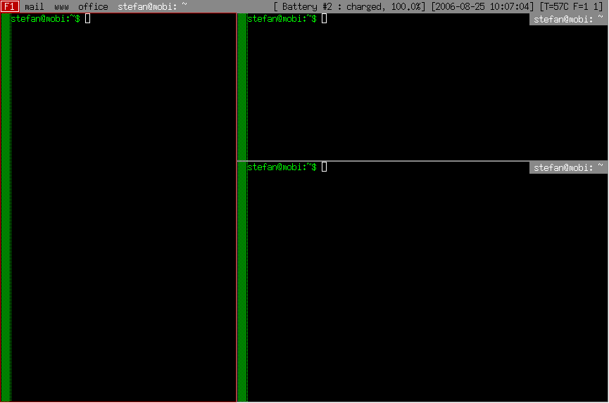
the use. At the moment I have coloursets of 3 colours (fg,bg,border)
for view, selected view, title area, info area. The non-highlighted
stuff share the same bg(grey). Normal views and status the same
fg(black). Highlighted views have different bg(dark red) and title
and highlighted views share the same fg(white).
(A cut-down screenshot is attached.)
> Yes, I consider a small box in the left indicating float/tiled mode.
This looks nicer than the frame, yes.
Regards,
Stefan
--
Der GMX SmartSurfer hilft bis zu 70% Ihrer Onlinekosten zu sparen!
Ideal für Modem und ISDN: http://www.gmx.net/de/go/smartsurfer