That looks nice.
FRIGN <dev_AT_frign.de> a écrit :
>Good evening,
>
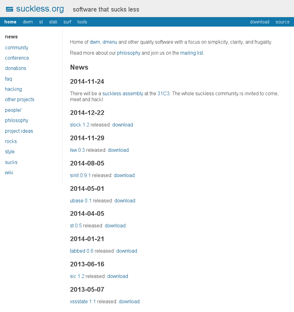
>looking at suckless.org, it's almost too bad the well-designed
>suckless-'S' only exists as a favicon.
>The motivation to bring the logo in more prominently is that
>people remember images even better than names, and getting
>attention in regard to current issues in computing is always
>a good thing, getting people more interested in what suckless
>reall is.
>So I sat down this afternoon, made a vectorized version of
>the logo and made up my mind on how to include it into suckless.org.
>
>You can view the result here[0], open for discussion obviously.
>
>As you may see, there have been other changes besides including
>the logo:
>
>1) Give the heading "suckless.org" a blue color
>2) Make the subheading a bit lighter
>3) Remove the text-shadow and italics in the header
>4) Remove italics from active links
>5) Give headings in the content a slightly lighter black
>
>Overall, it doesn't change much and these are just minor details,
>but it opens the way up to print the logo on caps or stickers
>and looking at the suckless assembly at the 31C3, we are in dire
>need of some simple icon to identify us.
>
>Let me know what you think.
>
>Cheers
>
>FRIGN
>
>[0]: http://frign.de/static/suckless_org_proposal.png
>
>--
>FRIGN <dev_AT_frign.de>
>
Received on Sun Feb 01 2015 - 20:43:15 CET